
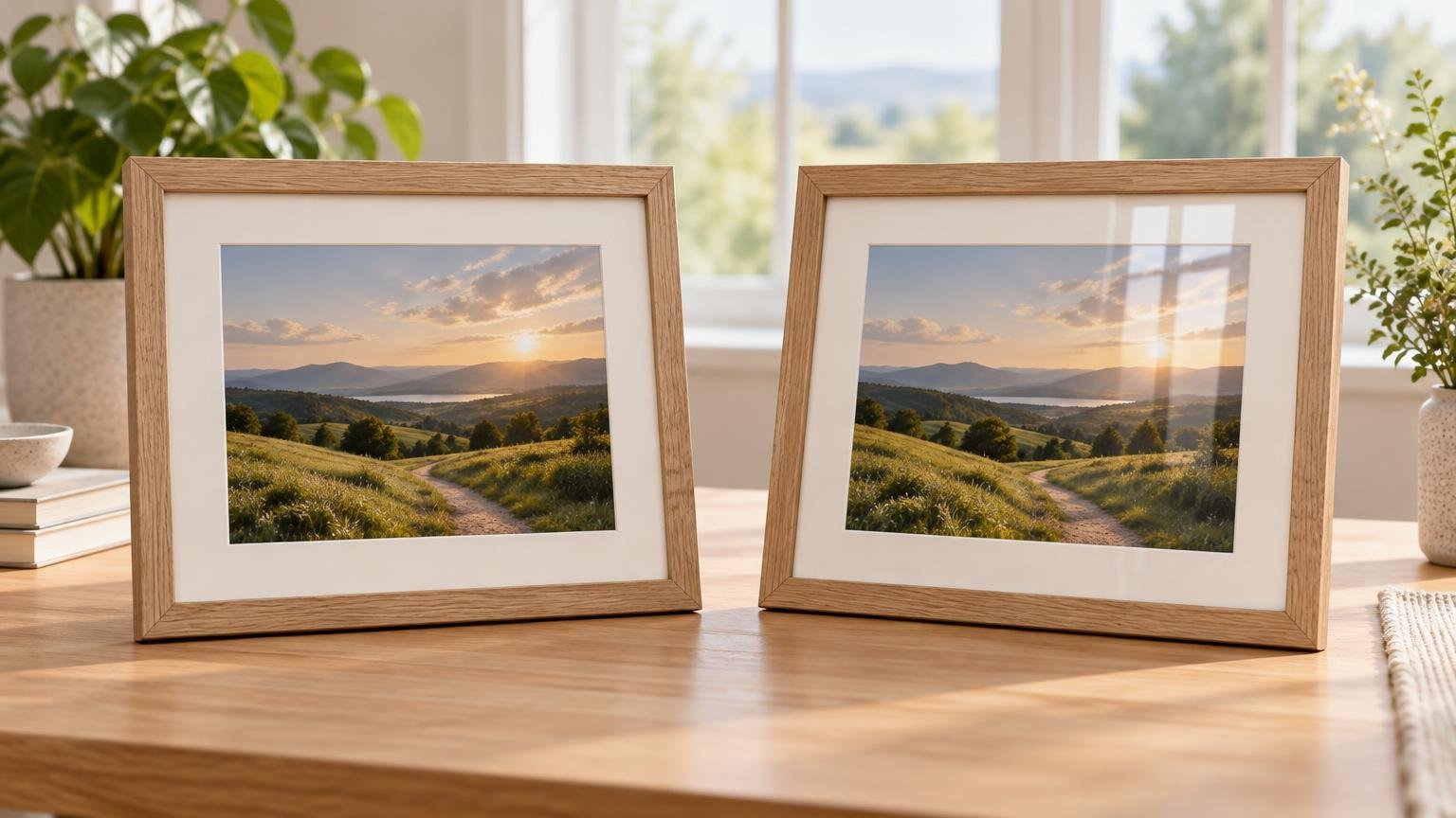
For framed photos, choose glossy when you want strong visual punch and can control reflections. Choose matte when the picture will hang near windows, opposite lamps, under bright overhead lights, or anywhere people will view it from several angles. In the matte vs glossy photo prints decision, the room usually matters more than whether the image is a portrait or landscape.
Gloss can make saturation, contrast, and dark tones appear more intense, but its reflective surface may compete with the picture once glass or acrylic is added. Matte has a quieter presentation with less disruptive glare and is more forgiving of fingerprints. Neither finish is automatically higher quality; each changes how the same image behaves under real display conditions. Fujifilm similarly associates gloss with reflectivity and stronger saturation and contrast, while describing matte as the lower-glare choice.
The quick decision: choose the finish for the room
| Display condition | Better starting choice | Why |
|---|---|---|
| Bright room with large windows | Matte | Lower surface reflection makes the image easier to see from changing angles. |
| Dim room or controlled gallery lighting | Glossy | Controlled light lets the stronger apparent contrast and saturation take center stage. |
| Framed behind reflective glass | Matte | It avoids adding as much surface reflection beneath already reflective glazing. |
| Framed behind low-reflection glazing | Either | The image style and desired presentation can carry more weight. |
| Loose prints handled frequently | Matte | Fingerprints and minor handling marks tend to be less conspicuous. |
| Vivid vacation or landscape image | Glossy, if lighting is controlled | The finish can emphasize color and tonal impact. |
| Soft portrait in an airy room | Matte | The restrained surface suits a softer presentation and challenging light. |
| Unsure where the print will be displayed | Matte or luster | Both are safer choices when reflection conditions are unknown. |
This table gives starting points rather than laws. A dramatic landscape can look excellent on matte paper, and a portrait can look rich on gloss. Subject matter influences the mood; lighting determines whether viewers can comfortably see the result.
How glare changes the matte vs glossy photo prints decision
Glossy paper has a smooth, reflective surface. That reflectivity can produce a polished, high-impact appearance, but it also catches windows, ceiling fixtures, lamps, and even bright clothing worn by the viewer. Reflections become more obvious as the viewing angle changes.
Before choosing, stand where the framed picture will hang and look toward it at different times of day. Check the position from the sofa, doorway, desk, or dining table—not only from directly in front. A window that seems harmless at noon may become a glowing rectangle across the photograph in late afternoon.
Matte paper scatters light more diffusely, producing a lower-reflection surface. That makes it the safer option for hallways, offices with overhead fixtures, bright living rooms, and walls opposite windows. Big Print World’s broader comparison of poster paper and photo paper likewise recommends choosing a finish around the room and display setup rather than assuming one surface is universally premium.
Gloss works best when light can be directed rather than allowed to bounce straight back at the viewer. A wall away from windows, indirect illumination, and a predictable viewing position all make gloss easier to use. If you are planning a larger piece, also confirm that the file can support the chosen dimensions using this guide to printing phone photos at larger sizes. A perfect finish cannot rescue a file enlarged beyond what its detail can support.
Gloss delivers punch; matte delivers restraint
The most visible aesthetic difference is not simply “shiny versus dull.” Gloss often creates stronger apparent depth, saturation, and contrast. Dark areas can look particularly rich, while saturated blues, greens, reds, city lights, and sunset colors gain immediate impact. Epson’s glossy photo-paper description emphasizes brilliant, lifelike color, although that claim applies to a particular paper rather than every glossy product from every printer.
Matte produces a more subdued, low-sheen presentation. It can feel calm, soft, and deliberate, especially with portraits, muted palettes, black-and-white photographs, or images intended to blend into a bright interior. Its reduced reflectivity can also reveal image content more consistently across a wide seating area.
That does not mean matte is inaccurate or gloss is inherently sharper. The final result depends on the paper, coating, printer, inks or photographic process, color management, source file, illumination, and viewing distance. Finish can change perceived color and detail without changing the pixels in the file. Readers concerned about the larger color workflow may also want the explanation of RGB and CMYK for consumer prints.
For expensive wall art, compare the precise papers offered by the printer rather than buying from the finish name alone. Matte from one service may look smoother or more textured than matte from another. Gloss can also vary in reflectivity and coating. Paper names are useful categories, not universal recipes.
Fingerprints and handling favor matte
Glossy surfaces tend to reveal fingerprints, scratches, smudges, and stains more readily. This matters less when the print arrives clean, goes directly into a frame, and stays there. It matters much more for loose prints, photo boxes, classroom displays, albums with removable pages, and gifts likely to be passed around before framing.
Matte is usually more forgiving under casual handling. It can still be marked or damaged, so clean, dry hands and edge handling remain sensible, but every touch is less likely to become part of the composition. Gloss wins the color-pop contest and occasionally enters the fingerprint contest without being invited.
If a photo will be mailed or given as an unframed gift, matte is the lower-maintenance default. If it will be framed immediately, handling should be a secondary consideration behind room lighting and the desired look.
Framing behind glass or acrylic
A glossy print is not automatically unsuitable for framing. The important issue is the combination of print surface, glazing, lighting, and viewing angle. Standard glass or acrylic can reflect the room on its own; placing a reflective print behind it may create another reflective layer. Matte reduces the contribution from the print, although it cannot remove reflections produced by the glazing itself.
Low-reflection glazing can make either finish easier to view, but it does not make the room irrelevant. Ask a framer to show you the actual glazing under light when possible. Product labels such as “non-glare,” “anti-reflective,” and “UV-filtering” describe different properties and should not be treated as interchangeable.
Keep the photograph from resting directly against glass or acrylic. The Library of Congress guidance for displaying photographs recommends an archival-quality window mat or spacers to separate a photograph from glazing. The National Archives offers similar advice for framed family papers and photographs. This is especially important for valuable or irreplaceable photographs, but it is also good practice for an ordinary display print.
A mat changes the visual presentation as well as providing separation. It creates breathing room around the image and can make a modest print feel more finished. Spacers are useful when you want the photograph to fill more of the frame without a visible mat. For a broader ordering discussion, see where to print large family photos for framing.
UV-filtering glazing can help reduce damaging ultraviolet exposure, but it does not make a photograph immune to light. Light-related deterioration accumulates, so valuable prints should not be placed in persistent direct sunlight even when protective glazing is used. A replaceable consumer reprint permits more flexibility, but moving the frame away from harsh sun will still reduce avoidable fading risk.
Portraits versus landscapes: use the image as a tiebreaker
When matte suits a portrait
Matte often works well for softly lit portraits, wedding photographs, newborn pictures, and black-and-white family images. Its restrained surface can support gentle skin tones and keep reflections from interrupting faces. It is especially practical when a framed family portrait will hang in a bright living room where people see it from different seats.
This is a preference, not a technical rule. A high-contrast studio portrait with deep blacks can look impressive on gloss when the lighting is controlled. Decide whether you want the surface to recede or contribute to a polished, high-impact presentation.
When gloss suits a landscape
Gloss is a natural candidate for saturated travel photographs, reflective water, colorful foliage, sunsets, night skylines, and other scenes built around contrast and color. In a dim hallway or a room with carefully positioned lights, that extra visual punch may be exactly the point.
Matte may be better for a landscape displayed opposite a window, however, because a theoretically punchier print is not much help when the viewer mainly sees the window. Matte can also complement fog, snow, desert tones, woodland scenes, and understated fine-art photography. If paper texture and a less photographic presentation appeal to you, compare photo paper and fine art paper before ordering.
Luster, satin, and semi-gloss offer a middle ground
If gloss feels too reflective and matte seems too restrained, look for luster, lustre, satin, pearl, or semi-gloss. These names commonly indicate an intermediate sheen, offering some visual richness with less mirror-like reflection than a high-gloss surface. Existing Big Print World guidance treats luster and semi-gloss as middle-ground choices.
Vendor terminology is inconsistent, so do not assume two products called “satin” will match. Texture, sheen, coating, and fingerprint resistance can vary. Examine a sample kit or order small prints of the same image before committing to a large wall piece.
A useful test image should include skin tones, dark shadow detail, a bright highlight, saturated color, and a neutral area. View the samples in the intended room during daylight and after turning on the evening lights. Tilt them and move to the normal viewing positions. This simple comparison is more useful than trying to pick a universal winner from a product-menu label.
What to verify before ordering
- The exact paper name and surface, because finish terminology varies between providers.
- Whether sample prints or a paper swatch book are available.
- The crop shown in the ordering preview, especially for nonstandard frame proportions.
- Whether the file has enough resolution for the intended dimensions.
- The finished frame’s glass or acrylic type and its reflective properties.
- Where windows, lamps, and overhead fixtures sit relative to the frame.
- Whether the print will be framed immediately or handled as a loose photograph.
- Current price, shipping, production estimate, and replacement policy.
For a small, replaceable print, choosing from these principles is usually enough. For a large print, a sentimental photograph, or a costly custom frame, buy a small matte and glossy proof first. The proof will not perfectly reproduce the visual scale of the final piece, but it can expose distracting glare, blocked shadows, unexpected color, or a surface that simply does not suit the room.
The final recommendation
Choose matte for bright rooms, uncertain lighting, wide viewing angles, frequently handled prints, and displays where a calm, low-reflection surface matters most. Choose glossy for controlled lighting, immediate color impact, rich apparent contrast, and photographs that benefit from a polished presentation.
For framed photos, start with the wall rather than the subject. Check the light, glazing, and normal viewing positions. Then use portrait-versus-landscape preferences as the tiebreaker. If the room changes throughout the day or the display location is not settled, matte or a moderate luster finish is the safer order. If the lighting is controlled and you want the image to announce itself from across the room, gloss earns its shine.
Frequently Asked Questions
Is matte or glossy better for framed photos?
Matte is the safer starting choice in bright or reflection-prone rooms. Glossy can work well when lighting and viewing angles are controlled; neither finish is universally better.
Does glossy photo paper make colors look more vibrant?
Gloss can make saturation, contrast, dark tones, and depth appear stronger. The result still depends on the specific paper, printer, image, color management, and lighting.
Do glossy prints show more fingerprints than matte prints?
Yes. Fingerprints, smudges, scratches, and stains tend to be more conspicuous on glossy surfaces, making matte more forgiving for loose or frequently handled prints.
Does framing glass make a glossy print too reflective?
Not always, but reflective glazing and a glossy print can create multiple reflective surfaces. Matte reduces reflection from the print itself, while low-reflection glazing can make either finish easier to view.
Is luster or satin a good compromise?
It can be. Luster, satin, pearl, and semi-gloss commonly provide an intermediate sheen, but terminology and surface characteristics vary by provider. Check a sample or swatch before ordering.
References
- Poster Paper vs Photo Paper: Cost, Finish, and Display Differences – bigprintworld.com
- Uncoated Paper vs. Matte, Dull and Glossy Paper – Fujifilm
- S041271Photo Paper Glossy, 8.5" x 11", 100 sheets | Epson US
- Photographs – FAQ – About (Preservation, Library of Congress)
- How to Preserve Family Archives (papers and photographs) | National Archives