
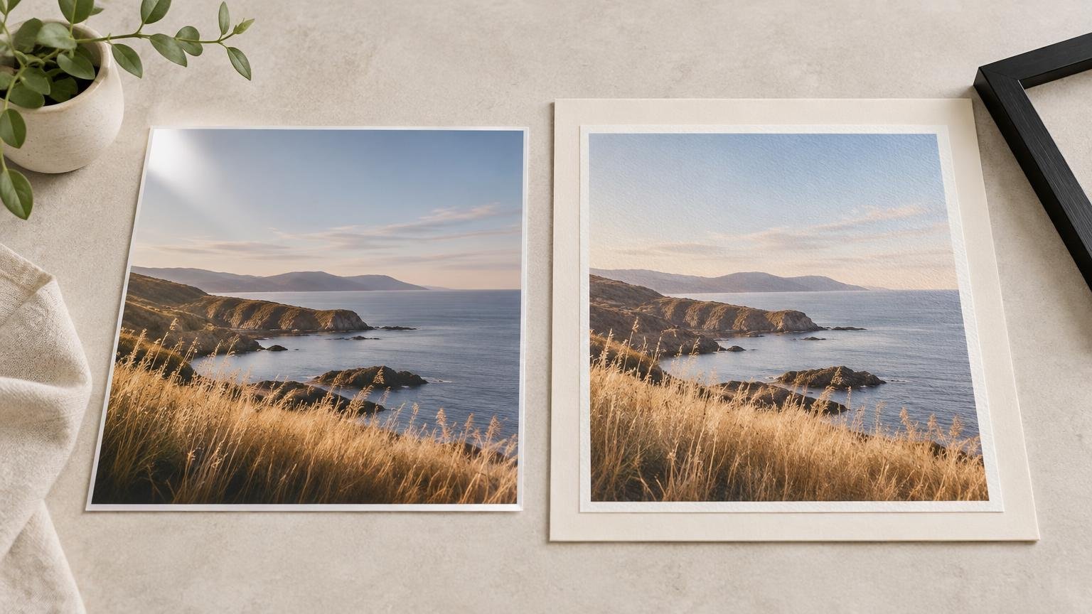
TLDR
In the photo paper vs fine art paper decision, neither category is automatically better. Choose photo paper when you want a smooth photographic finish, crisp-looking detail, strong contrast, or gloss and luster options. Choose fine art paper when a matte surface, heavier sheet, subtle texture, or art-paper presentation complements the image. Before ordering, verify the exact paper, printing process, profile support, framing plan, and total finished cost.
The labels sound more decisive than they are. “Photo paper” can mean glossy, luster, satin, or matte media, while “fine art paper” can cover smooth or textured sheets made with different fibers and coatings. Canon and Hahnemühle both present these as broad, partly overlapping media families rather than two standardized constructions. The useful comparison is therefore not prestige versus practicality. It is surface, image, output process, display environment, and budget.
Photo paper vs fine art paper at a glance
| Decision factor | Photo paper | Fine art paper |
|---|---|---|
| Surface | Commonly available in gloss, luster, satin, and matte finishes | Commonly emphasizes smooth matte or visibly textured artist-paper surfaces |
| Visual character | Often produces a sleek, photographic presentation | Often gives the print more tactile and material presence |
| Blacks and contrast | Glossy and luster surfaces can make contrast and dark tones appear punchier | Matte surfaces may present blacks more softly, although results depend on the paper, ink, profile, and image |
| Color | Often chosen for vivid photography and smooth tonal transitions | Often chosen for illustrations, art reproductions, and photographs that suit a restrained matte presentation |
| Glare | Gloss is the most reflective; luster and matte reduce reflections to different degrees | Usually low-glare, although texture can scatter light unevenly |
| Handling | Glossy surfaces readily show fingerprints and reflections | Matte sheets avoid obvious fingerprints but may still be vulnerable to scuffs, abrasion, and edge damage |
| Framing | Works framed or unframed, but glossy paper behind glass can create two reflective surfaces | Often attractive behind a mat, with spacing from the glazing |
| Compatibility | Must match the printer or lab process and supported media settings | Thickness, feed path, coating, ink system, and profile support require particular attention |
| Best fit | Family photos, high-impact color photography, portfolios, and economical standard prints | Art reproductions, digital illustration, limited-edition presentation, and images enhanced by a matte or textured surface |
| Cost | Standard lab formats may provide practical entry points, but price varies | Specialty sheets and handling may increase cost, but category labels alone do not determine the final total |
The surface changes the print more than the label
Surface finish affects reflected light, apparent contrast, white appearance, and the way dark areas read. Glossier surfaces reflect more light, while matte and textured surfaces reduce direct glare. That does not mean gloss has objectively better blacks or matte has objectively better color. The image, paper coating, ink, printer, profile, lighting, and viewing angle all contribute to the result.
Glossy photo paper
Gloss is the obvious choice when visual punch matters more than subtlety. It can make saturated color, polished commercial photography, water, glass, chrome, and night scenes look especially lively. The tradeoff is reflection: a dark print opposite a window may spend part of the day functioning as an accidental mirror. Gloss also makes fingerprints and surface marks easier to see.
Luster and satin photo paper
Luster or satin is the practical middle ground for many photographs. It retains some sheen and apparent contrast without behaving quite as reflectively as full gloss. For a framed family portrait, travel photograph, or general wall print, this is often the safest starting point when you want a recognizable photographic look but cannot control every lamp and window in the room.
Matte photo paper and smooth fine art paper
These can be closer competitors than their names suggest. Both may provide a low-reflection surface, but a fine art sheet may be heavier or designed to contribute more physical presence. Exact construction still matters. For example, Epson describes one UltraSmooth Fine Art Paper as a 250 gsm cotton paper designed for selected Epson ink systems, but that specification describes one product—not the entire fine art category.
Textured fine art paper
Texture becomes part of the artwork. It can complement watercolor reproductions, expressive illustration, landscapes, charcoal-style work, and images in which atmosphere matters more than clinically smooth detail. It can also compete with tiny type, hairline geometry, delicate facial detail, or highly polished product photography. For detail-sensitive work, order a sample using a representative crop rather than judging texture from a product-page thumbnail.
Choose the paper for the image
The subject does not impose a hard rule. Photography can look excellent on fine art paper, and illustration can look excellent on photo paper. Start with the desired presentation:
- Family and event photographs: Start with luster or satin photo paper for a balanced photographic finish. Choose matte if the display area is bright and reflections are distracting.
- High-impact color photography: Gloss or luster is usually the first sample to request when saturation, polished surfaces, and apparent contrast are central to the image.
- Black-and-white photography: Compare at least one luster surface with one smooth matte paper. The better option depends on the tonal character you want and the printer’s supported black-ink workflow, not the category name alone.
- Digital illustration: Smooth fine art paper suits work intended to feel like an art object. Luster photo paper may be preferable for bright, graphic work that benefits from extra sheen.
- Painting and watercolor reproduction: A compatible fine art paper with restrained or deliberate texture can reinforce the original medium. Too much texture can introduce a surface character the original never had.
- Line art, small text, and intricate geometry: Favor a smooth paper and request a proof. Pronounced texture can interrupt delicate edges when viewed closely.
Resolution and enlargement still matter regardless of paper. A premium sheet cannot restore detail missing from the file. If you are enlarging a phone image, check how large a phone photo can be printed before paying for a specialty stock.
Printer and ink compatibility come before aesthetics
A beautiful paper is useless if the selected printer cannot feed it or place ink on it correctly. Paper makers and printer manufacturers may specify compatible printers, ink systems, media settings, and feed paths for individual products. Home printers can use some fine art papers, but “inkjet paper” does not mean “compatible with every inkjet.”
Check the exact paper model against the printer manual. Heavy or rigid media may need a rear or straight feed path. The printer driver may require a particular media setting to control ink limits, head height, and paper handling. Some machines also switch between photo-black and matte-black ink for different surface types.
An ICC profile helps a color-managed workflow translate image values for a specific printer, ink, and paper combination. It does not turn an unsupported paper into a supported one, nor does it guarantee a perfect match to a glowing screen. If color is critical, ask whether the provider uses a profile or calibrated process for that exact stock and whether a physical proof is available. For a broader explanation of file preparation, see our guide to RGB vs CMYK for consumer print.
Labs using chromogenic, dye-sublimation, or other output processes may offer a different media selection from a pigment-inkjet studio. Do not assume that two products called “fine art matte” are interchangeable. If you are comparing online services or browsing custom printing options, confirm both the stock and the process rather than relying on the menu label.
Glare, handling, and framing can change the winner
Room conditions can overturn a paper decision that looked obvious on a screen. Glossy paper may be striking under controlled lighting but frustrating opposite a bright window. Matte paper is easier to view from varied angles, although a textured surface can create its own small highlights under raking light.
Handling also differs. Hold any finished print by clean edges and avoid rubbing its face. Gloss makes fingerprints conspicuous, while matte and textured sheets can pick up scuffs or pressure marks. A heavier paper may feel more substantial, but weight alone does not make the printed surface immune to damage.
For framed works, the Library of Congress recommends keeping paper objects from direct contact with glazing by using suitable matting or spacers. It also advises limiting direct or intense light exposure. UV-filtering glazing reduces part of the damaging radiation but does not stop cumulative light damage. Library of Congress matting and framing guidance
Consider reflections from both the print and the glazing. A glossy print behind ordinary glass combines two reflective surfaces. A luster or matte print can make the finished piece easier to view, but anti-reflective glazing may matter more than changing paper in particularly difficult rooms. For more display comparisons, our poster paper vs photo paper guide covers mounting, finish, thickness, and glare.
Be cautious with archival and longevity claims
Terms such as “archival,” “museum-grade,” “acid-free,” “lignin-free,” and “cotton rag” describe claims or material attributes, not a guaranteed lifespan for every finished print. Canon notes that image stability depends on the ink, paper, image, drying, storage or display conditions, and surrounding environment. A cotton sheet printed with an unsuitable ink and displayed in harsh sunlight does not earn immortality through vocabulary.
For a meaningful permanence claim, look for testing tied to the exact printer, ink, paper, protective treatment, display conditions, and endpoint criteria. Results obtained under one test configuration should not be transferred casually to another. In ordinary buying terms, the sensible approach is to use a documented compatible system, allow appropriate drying or curing, frame properly, and avoid direct sunlight, high humidity, pollutants, and rough handling.
Compare the total finished cost
Fine art paper often occupies the specialty end of a provider’s menu, but there is no universal price gap. Size, paper model, ink coverage, border treatment, minimum order, proofing, mounting, framing, packaging, and shipping can matter more than the category label. Promotions can make an apparently premium option cheaper on one order and more expensive on the next.
Ask for comparable totals. A loose 8-by-10 print and a matted, framed specialty print are not competing quotes. Compare the same dimensions, border, mounting, frame, glazing, shipping speed, and replacement policy. For a large framed order, our guide to printing large family photos for framing covers additional file and size decisions.
The upgrade is worthwhile when the paper visibly supports the image or gives the finished object the presence you want. It is less compelling when the print will sit behind highly reflective glazing, be viewed from across a room, or be replaced frequently. Paying for texture that nobody can see is not collecting sophistication points.
Questions to ask before ordering
- What is the exact manufacturer and paper name?
- Is the surface gloss, luster, satin, smooth matte, or textured matte?
- What are the listed weight in gsm and thickness or caliper?
- What is the paper base: resin-coated, cotton, alpha-cellulose, or another construction?
- Which printing process, printer, and ink type will be used?
- Is the paper officially supported by that printer or process?
- Is a stock-specific ICC profile or established production profile used?
- Will deep blacks use an appropriate ink and media setting for this surface?
- Does the sheet require a special feed path or border?
- Are optical brightening agents disclosed if their presence matters to the project?
- Can you order a sample or small proof containing dark tones, skin tones, saturated color, fine detail, and neutral gray?
- If longevity is advertised, what exact paper, ink, display conditions, and test method support the claim?
- What is the delivered price after proofing, borders, mounting, framing, glazing, and shipping?
Final verdict
Choose photo paper when you want a smooth photographic presentation, gloss or luster impact, familiar lab-style options, or a practical standard print. Choose fine art paper when a matte surface, substantial sheet, or deliberate texture strengthens the image and justifies the additional ordering and framing considerations.
If the decision is close, order the same representative crop on a luster photo paper and a smooth or lightly textured fine art paper. View both in the room where the work will hang, under daytime and evening light. The winning sample is the one that serves the image and survives the actual display conditions—not the one with the grander product name.
References
- Canon : Inkjet Manuals : Digital Photo Printing Guide : Media Types
- FineArt inkjet and photo papers
- What Makes an Ink “Archival”? | Canon U.S.A., Inc.
- S042141UltraSmooth Fine Art Paper, 60" x 50', 1 roll | Epson US
- Preservation Guidelines for Matting and Framing – Collections Care (Preservation, Library of Congress)
- Paper – FAQ – About (Preservation, Library of Congress)