
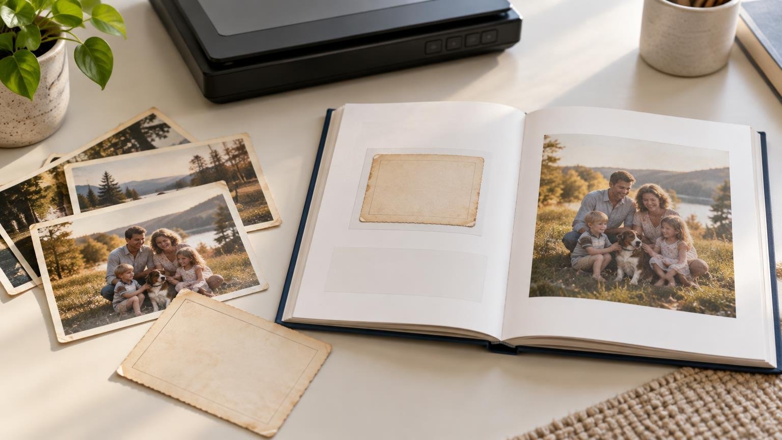
For a photo book made from old family snapshots, scan a typical 3-by-5-inch print at 600 ppi as a practical baseline. Choose 800 ppi when you expect to crop heavily, use large page placements or preserve a more flexible digital copy. Scan meaningful handwritten backs separately, keep an untouched version of every scan and place captions where they add context without covering the photograph.
That approach gives a small original enough pixels for a useful enlargement without pretending that resolution can repair everything. A sharp 3-by-5 print can carry a surprisingly large page layout. A soft, faded or grainy original remains soft, faded or grainy—only bigger. The goal is faithful capture and thoughtful presentation, not forensic reconstruction of Uncle Ed’s missing left ear.
Start with what a 3-by-5 photo can actually provide
Scan resolution describes how many pixels are captured from each inch of the original. A 3-by-5 photograph scanned at 600 ppi becomes a 1,800-by-3,000-pixel file. At 800 ppi, it becomes 2,400 by 4,000 pixels. Those dimensions, rather than the scanner setting printed on a product box, determine how much room you have for enlargement and cropping.
| Scan setting | Resulting pixel dimensions | Uncropped placement at 300 ppi |
|---|---|---|
| 300 ppi | 900 × 1,500 pixels | 3 × 5 inches |
| 400 ppi | 1,200 × 2,000 pixels | 4 × 6.7 inches |
| 600 ppi | 1,800 × 3,000 pixels | 6 × 10 inches |
| 800 ppi | 2,400 × 4,000 pixels | 8 × 13.3 inches |
These are mathematical output sizes, not promises of visible detail. The calculation divides pixel dimensions by the intended print resolution. A 1,800-pixel short side, for example, supports 6 inches at 300 ppi. The final result still depends on the focus, grain, contrast, damage and detail in the original print.
The National Archives lists 400 ppi at original size as a minimum for photographic prints and paper records containing fine detail, while its more detailed technical guidance gives an approximate 800 ppi preservation target for photographs around 4 by 5 and 3.5 by 5 inches. The Library of Congress scanning guidance says 300–400 dpi is generally satisfactory for ordinary snapshots at common output sizes up to 8 by 10, but recommends at least 600 dpi when enlarging a 4-by-6 original to 8 by 10.
For a consumer photo-book project, 600 ppi is the sensible middle ground: enough resolution for a meaningful enlargement without treating every wallet-sized snapshot like a museum digitization project. An 800 ppi scan is worthwhile when the photograph is important, the book may use full-page images, or future relatives might want to crop and reprint it.
Do not confuse more pixels with more detail
Higher optical scan resolution can capture more of what is physically present in the print. It cannot recover detail that never made it onto the paper or was lost to motion blur, poor focus, fading or surface damage. The Library of Congress recommends testing when enlargement quality matters, and National Archives guidance warns that interpolating a low-resolution scan is not a substitute for capturing the original at an adequate optical resolution.
That distinction matters when scanner software offers an enormous resolution through enhancement or interpolation. Enlarging a file after capture creates additional pixels by calculation; it does not reveal a face that was already a blur. Use the scanner’s optical capture setting, inspect the result at the intended page size and let the condition of the original set the limit.
A useful test is to scan one representative photograph before processing the whole box. Pick a print containing a face, clothing texture, a darker area and some fine background detail. Place it in a draft page at the largest size you expect to use. If it looks acceptable there, the same scan setting is a reasonable starting point for photographs of similar size and condition.
How large can the scan sit on a photo-book page?
A 600 ppi scan of a 3-by-5 print supplies enough pixels for an uncropped 6-by-10-inch placement at 300 ppi. An 800 ppi scan supplies enough for 8 by 13.3 inches at the same output resolution. In practical terms, either can work well in many standard books, but page shape and cropping become just as important as pixel count.
A 3-by-5 photograph has a 3:5 aspect ratio. An 8-by-10 page or image box has a 4:5 ratio, so the two shapes do not match. To fill the 8-by-10 area edge to edge, the layout must crop part of the long dimension. If the entire original is important, fit it inside the page and accept margins instead.
At 800 ppi, the 3-by-5 scan is 2,400 pixels across its short side, enough for an 8-inch-wide placement at 300 ppi. It can fill an 8-by-10 vertical area only after cropping its original proportions. At 600 ppi, the 1,800-pixel short side works out to about 225 ppi when stretched across 8 inches. That may still look acceptable for some originals, but it leaves less room for cropping and close inspection.
Before choosing the book format, decide whether the project will feature one large photograph per page or several smaller images. A larger book does not automatically improve a collection of tiny originals; it can simply create pressure to enlarge every picture. The guide to choosing a photo-book size can help match the format to the number and shape of the photographs.
Use three placement tiers
A practical layout can treat scans according to their quality rather than forcing every photograph into the same template:
- Full-page or near-full-page: reserve these placements for sharper, important photographs scanned at sufficiently high resolution.
- Half-page: a strong default for a 3-by-5 snapshot because it provides enlargement without putting every flaw under a spotlight.
- Small supporting image: use for soft, damaged or repetitive photographs that still add useful people, places or chronology to the story.
This creates visual hierarchy and protects weaker originals from unflattering enlargement. It also makes the book feel edited rather than emptied directly from a shoebox.
Scan handwritten backs as part of the photograph’s story
A handwritten back may contain names, dates, locations, relationships, signatures or a wonderfully vague note such as “at the lake, probably 1952.” That writing is not clutter. It may be the only surviving link between the image and the people in it.
The Smithsonian Institution Archives digitization guidance calls for scanning the reverse of a reflective photograph when it contains annotations, drawings or other significant markings. The Archives of American Art likewise directs technicians to scan the back of an unmounted photograph when it contains writing.
Scan the back at a setting that keeps the handwriting readable, and associate it clearly with the front. A simple paired naming system can prevent confusion later: one identifier for the item, followed by a front or back designation. Keep the full edges in the capture when they help distinguish the physical object or preserve writing near a border.
Capture old monochrome and sepia photographs in RGB color when paper tone, colored ink, stamps, pencil marks or other physical characteristics matter. National Archives guidance recommends RGB capture when color or other characteristics are needed for interpretation. A grayscale conversion can always be made later; a color discarded during scanning is harder to recover.
Typed caption, back scan or both?
A typed caption and a scan of the handwritten back solve different problems. The caption helps a reader understand the page quickly. The back scan preserves the original handwriting and the exact wording, including uncertainty, spelling and personality. One is an editorial aid; the other is a facsimile of the source.
Use both when the writing is historically or emotionally important. A clean caption might read, “Mara and Joseph Bell, Lake Erie, circa 1952,” while a nearby reproduction shows the original note exactly as written. If a name or date is uncertain, preserve that uncertainty rather than silently turning a guess into family fact.
There is no single archival rule dictating where captions belong in a consumer photo book. A useful default is to place the typed caption below or beside the front image and put the back scan on the facing page, in a margin column or in a dedicated notes section. Archives of American Art guidance emphasizes capturing the complete item and preserving written backs, leaving the book designer free to choose a readable presentation.
Caption placement that stays readable
- Below the image: the safest general choice for names, dates and locations.
- Beside the image: useful in landscape books or pages with generous outer margins.
- On the facing page: best when the handwritten back deserves a large, legible reproduction.
- In a grouped notes section: workable for image-heavy books, provided each note has an unmistakable photo identifier.
- Over the photograph: generally a poor choice for archival snapshots because it hides part of the image and can become unreadable over mixed tones.
Keep captions away from the binding, especially when a page contains small type or handwriting. Important faces, text and photograph edges also need breathing room near the center fold. The guide to photo-book gutter loss explains why a layout that looks centered on a screen may feel crowded after binding.
Build a repeatable scanning and layout workflow
Old-photo projects become difficult when scanning, identification and design all happen at once. Separate them into stages so that a late discovery—such as finding out that three men were all labeled “Cousin Bill”—does not require rebuilding half the book.
- Sort the prints into broad groups such as decade, family branch, location or event.
- Assign each physical photograph a unique identifier before scanning it.
- Scan the front at 600 ppi, or 800 ppi when large placement, cropping or future reuse justifies it.
- Scan the back whenever it contains meaningful writing, stamps, drawings or other identifying marks.
- Keep an untouched master and perform rotation, tonal correction, dust cleanup and cropping on a separate copy.
- Transcribe names, dates, locations and notes into a working caption list linked to each identifier.
- Choose the book size and create a few test layouts using large, medium and small image placements.
- Order pages by story rather than by whichever file happened to scan first.
- Review every crop, caption and page near the gutter before ordering.
For a long family history, page count can affect the book’s cost, pacing and readability as much as trim size. It is usually better to give important photographs room and remove near-duplicates than to shrink everything into a family census printed at postage-stamp scale. The guide to choosing a photo-book page count offers a practical way to plan the sequence before committing to a service.
Make the first test page before scanning everything
The best way to settle the 600-versus-800 ppi question is with one representative 3-by-5 original and one realistic page design. Scan it at both settings, place each version at the intended size and inspect the face, edges and background detail. Also compare the complete uncropped composition with the crop required to fill the page.
For most books, the winning formula is straightforward: scan carefully, enlarge selectively and preserve the writing that explains who everyone was. A sharp scan matters, but the names on the back and the decisions made on the page are what turn a folder of old pictures into a family book worth keeping.
Frequently Asked Questions
Is 600 ppi enough for an old 3-by-5 family photo?
Usually, yes. It creates a 1,800 × 3,000-pixel file, enough for an uncropped 6 × 10-inch placement at 300 ppi. The original photo’s sharpness and condition still determine how good the enlargement looks.
When should I scan a family snapshot at 800 ppi?
Use 800 ppi when you expect substantial cropping, want a large page placement or plan to keep a more flexible file for future reuse. It provides more pixels, not a miracle cure for blur or fading.
Can a 3-by-5 scan fill an 8-by-10 page?
Yes, but the proportions differ. A 3-by-5 image has a 3:5 aspect ratio, while an 8-by-10 area is 4:5, so filling it edge to edge requires cropping. Fit the complete image inside the page if every edge matters.
Should I scan the handwritten back of an old photograph?
Scan it when it contains names, dates, locations, drawings, stamps or other meaningful markings. Smithsonian guidance treats significant writing on a photograph’s reverse as content worth preserving.
Should old black-and-white and sepia photos be scanned in color?
Use RGB color when paper tone, colored ink, stamps, pencil marks or other physical details help interpret the photograph. You can make a grayscale copy later without discarding the color information in the master scan.
References
- Personal Digital Archiving: The Basics of Scanning | The Signal
- Technical Guidelines for Digitizing Archival Materials for Electronic Access: Creation of Production Master Files – Raster Images
- Digitizing Records: Requirements for Paper and Photographs – Records Express
- You Say You Want a Resolution: How Much DPI/PPI is Too Much? | The Signal
- Guide 3
- Smithsonian Institution Archives
- Digitizing Entire Collections: Chapter 4, For Scanning Technicians
- Digitizing Entire Collections: Chapter 4, For Scanning Technicians | Archives of American Art, Smithsonian Institution